Overview
You are a new intern at Luka Magic Co. and the CEO would like to know some information
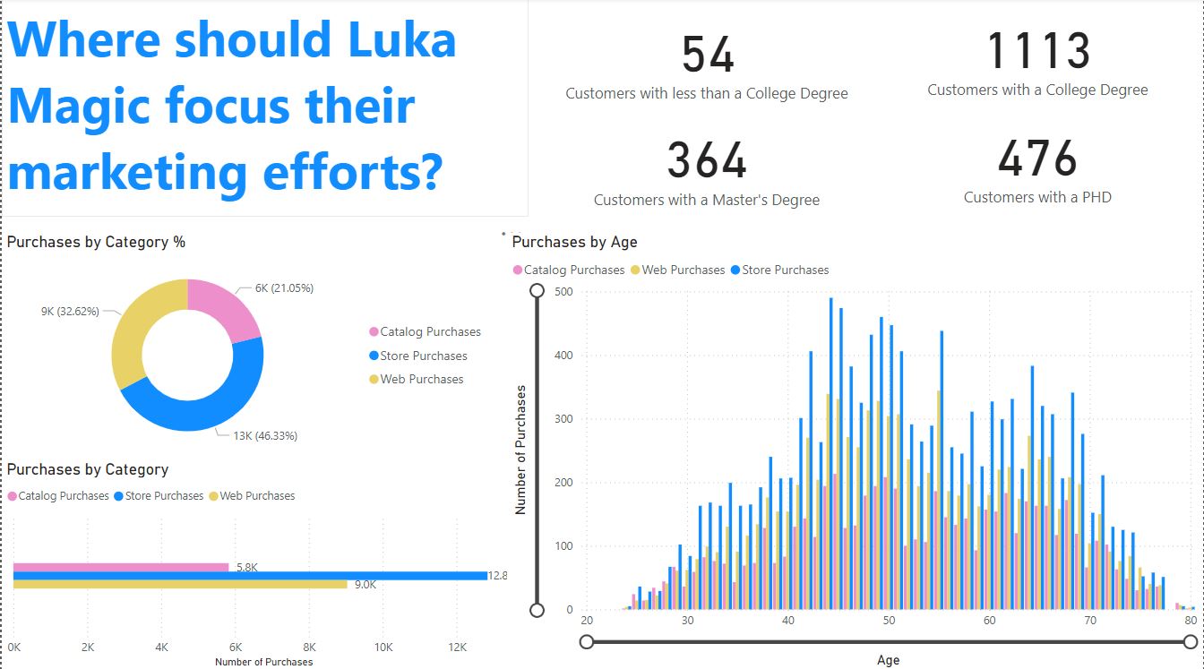
regarding the current customer basis. They want to know if they should focus marketing
efforts on the website, catalog, or the stores. The CEO would also like to see the number of purchases made by each level of education. They would also like to see the purchase option most used by age. Make a dashboard that displays this information to aid the decision-making process. This will be shown to the company executives so make sure it looks professional! Boa sorte!
Instructions
Import the data
Make a horizontal bar chart and donut chart showing the breakdown of purchases by category (bottom left corner)
Make a vertical bar chart showing purchases by age (bottom right corner)
Cards (4) showing number of purchases by age (top right corner)
Text saying “Where should Luka Magic focus their marketing efforts?” (top left corner
Note on the post: The card instructions are incorrect. It asks for cards showing purchases by age, not by education level.
Also, the video would be more helpful if it walked through how the viz was created, not just showing the finished product. I am a beginner with PowerBI and I could follow, but a full walkthrough would be nice. For example, I don’t know how to get total purchases by age without a stacked bar chart (which stacks the three purchasing mediums) and I’d like to know how the author did so.
Great challenge! This was great practice for me with all the different types of visualizations possible on Power BI. This also was great practice creating a dashboard that shows a lot of information but is not overwhelming to the audience. Thanks for the practice! Here’s my solution: