BYU Student Author: @Mike_Paulsin
Reviewers: @TylerBooth, @MitchFrei
Estimated Time to Solve: 60 Minutes
We provide the solution to this challenge using:
- Excel
Need a program? Click here.
Overview
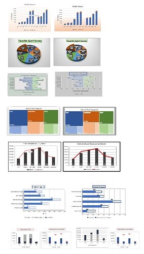
Welcome to the Excel Charting Challenge! The challenge consists of 7 different charts that you will need to create using the data provided. The aim of this challenge is to test your ability to manipulate data and create visually appealing charts using Excel’s charting tools.
For each chart, a picture has been provided of what the chart should look like when it’s finished. It’s your job to create a chart that matches the picture as closely as possible, using your knowledge of Excel charting tools to choose the most appropriate chart type for the data provided and apply the necessary formatting and styling.
The 7 charts that you will need to create include:
- Stacked bar chart
- 3D pie chart
- Comparative histogram
- Treemap chart
- Dual-axis line and bar chart
- Progress bar chart
- Actual vs. target chart
Your goal is to complete as many charts as you can in one hour, so it’s important to work efficiently and effectively. This challenge is designed to be challenging but achievable and is suitable for intermediate to advanced Excel users. Overall, this Excel challenge is intended to be a fun and engaging way for you to test and improve your data manipulation and charting skills, while also honing your attention to detail and ability to match visual references. Good luck and have fun!
Instructions
The instructions for this challenge are simple, for each picture in the data provided, create a chart that matches it as closely as possible. Use tools like Google and ChatGPT to help if you get stuck.
Data Files
Suggestions and Hints
Comparative Histogram Hints
- Edit the data in the “Female” column to be negative. This will make the horizontal bars for the females appear on the left-hand side of the middle.
- To make negative numbers appear positive on the x axis, do the following: 1) Right click on the x axis numbers and select “Format Axis.” From there, a tab should open up on the right-hand side. Select the “Number” drop down section. In the “Format Code” area, type 00;00;00. This will make all negative numbers appear positive.
Dual Axis Hints
- Right click on the “Units Sold” data series in the chart. Select “Format Data Series.” Go to the “Series Options” in the tab that appears on the right. Click the “Series Options” drop down menu and select “Secondary Axis.” This will create an axis on the right-hand side of the chart. From here, right click again on the “Units Sold” data series and select “Change Series Chart Type.” This should pull up a new window and at the bottom of that window you can make sure that the “Units Sold” series is a clustered column chart type, and the “Revenue” series is a line chart type.
Actual vs. Target Charts
- For the second chart, you should again make a dual axis chart. The “Target” data series should be formatted as a line chart with markers.
Solution
Challenge89_Solution.xlsx
Solution Video: Challenge 89|EXCEL – Charting Challenge
