BYU Student Author: @Mike_Paulsin
Reviewers: @Nate, @IWillyerd, @Brett_Lowe
Estimated Time to Solve: 15 - 25 Minutes
We provide the solution to this challenge using:
- Python
Need a program? Click here.
Overview
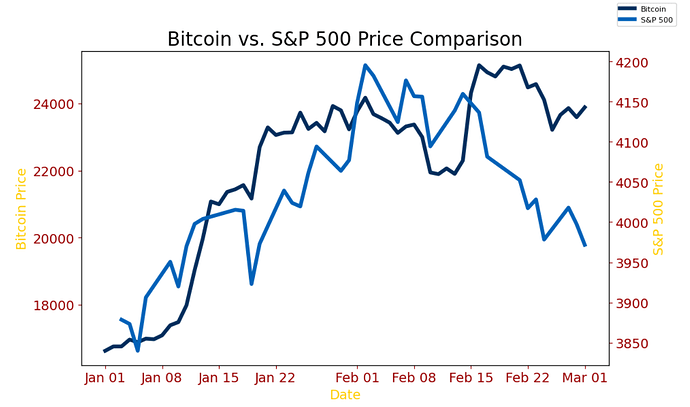
As part of this task, you are required to conduct a comparative analysis between the Bitcoin price data and the S&P 500 data for the first two months of 2023. The necessary data for January 2023 and February 2023 has already been provided to you, and your task is to leverage the powerful visualization capabilities of Python’s Matplotlib library to create a dual-axis graph that will enable you to effectively compare the two datasets.
The primary objective of this challenge is to help you gain a strong understanding of the fundamental concepts of Matplotlib, and to provide you with a foundation for future work with this powerful data visualization tool. To complete this task, you are encouraged to make use of available resources such as Google and ChatGPT to assist you in overcoming any challenges you may encounter. This exercise should take approximately 15-25 minutes to complete, and will be followed by further challenges that explore the intersection of cryptocurrency and stocks.
Instructions
- Start by using pandas to read the Bitcoin price data and the S&P 500 data from their respective Excel sheets into separate dataframes. This will allow you to easily manipulate and analyze the data in Python.
Suggestions and Hints
You can use the following code to achieve this:
df = pd.read_excel(“Challenge64_Bitcoin_Price_Data.xlsx”)
df1 = pd.read_excel(“Challenge64_S&P500_Price_Data.xlsx”) - Create two axes on the graph using matplotlib.
Suggestions and Hints
You can use the following code to achieve this:
fig = plt.figure()
axis1 = plt.subplots()
axis2 = axis1.twinx()This will create two y-axes on the same plot, with axis1 representing the left y-axis and axis2
representing the right y-axis. - Add the appropriate Bitcoin price data to the first axis.
Suggestions and Hints
You can use the following code to achieve this:
axis1.plot(bitcoin_dataframe[‘Date’], bitcoin_dataframe[‘High’], color=‘blue’, label=‘Bitcoin Price’)This will plot the Bitcoin price data on the left y-axis with a blue line and a label of ‘Bitcoin Price’.
- Add the appropriate S&P 500 data to the second axis using axis2.plot(). For example:
Suggestions and Hints
You can use the following code to achieve this:
axis2.plot(sp500_dataframe[‘Date’], sp500_dataframe[‘Price’], color=‘red’, label=‘S&P 500 Price’)This will plot the S&P 500 data on the right y-axis with a green line and a label of ‘S&P 500 Price’.
- Format both axes and the data to improve readability.
Suggestions and Hints
You can match the line colors and y-axis label colors of each line using axis1.set_ylabel() and
axis2.set_ylabel(), respectively. For example:
axis1.set_ylabel(‘Bitcoin Price’, color=‘blue’)
axis2.set_ylabel(‘S&P 500 Price’, color=‘red’)This will set the y-axis label of the Bitcoin price data to blue and the y-axis label of the S&P 500 data to green. You can customize the colors by replacing ‘blue’ and ‘red’ with colors of your choice.
- Change the tick mark labels of the x-axis to display the date in the format “Jan 1, Jan 8, etc.”
Suggestions and Hints
You can do this using axis1.xaxis.set_major_formatter() and specifying the desired date format. For example:
date_format = mpl.dates.DateFormatter(‘%b %d’)
axis1.xaxis.set_major_formatter(date_format)This will format the tick mark labels on the x-axis to display the date in the desired format.
By following these instructions, you should be able to create a well-formatted dual-axis graph that effectively compares the Bitcoin price data and the S&P 500 data.
Data Files
Solution
Solution Video: Challenge 64|PYTHON – Bitcoin vs. S&P 500 with Matplotlib Basics


