BYU Student Author: @Andrew
Reviewers: @Parker_Sherwood, @Mark
Estimated Time to Solve: 20 Minutes
We provide the solution to this challenge using:
- Excel
Need a program? Click here.
Overview
Every business will require large datasets to be summarized. Summarization can be done using several different tools. In Excel, pivot tables are great summarization tools to generate a non-visual report.
Instructions
You work for the advisory board at a public accounting firm. They have asked you to compile several reports for their review regarding revenue across the firm.
First, create a pivot table containing the total revenue for each practice by year. The pivot table should be in a new sheet called “Total Revenue”.
Second, create a pivot table displaying the total revenue for each region for the advisory practice in 2022. Sort the table by total revenue largest to smallest. The pivot table should be in a new sheet called “Advisory Revenue 2022”.
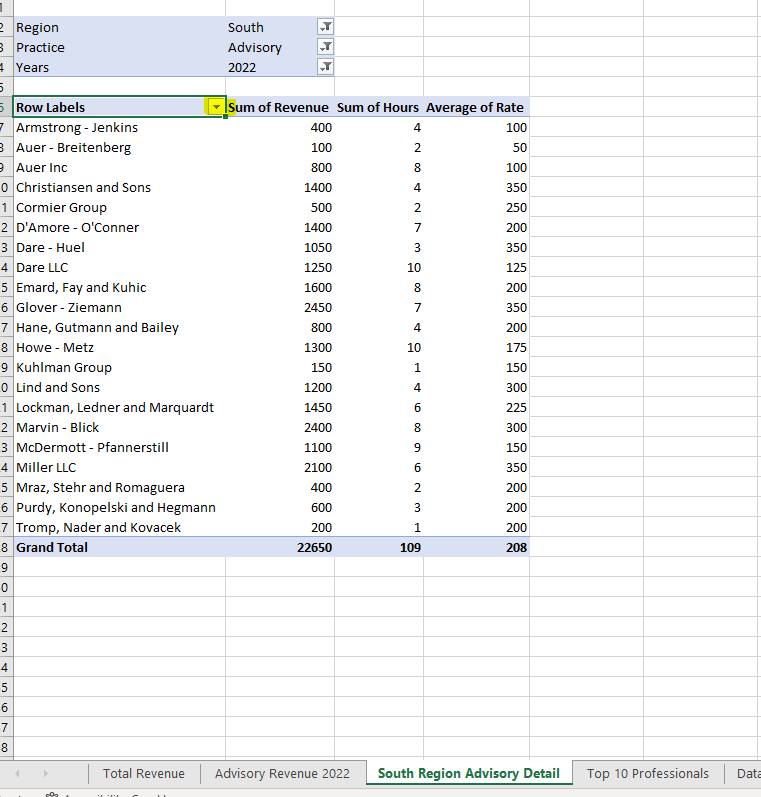
Third, create a pivot table containing the total revenue, total hours, and average rate billed per hour for each client serviced by the South region Advisory practice in 2022. Sort the table to show clients billed the highest average rate in descending order. The pivot table should be in a new sheet called “South region advisory detail”.
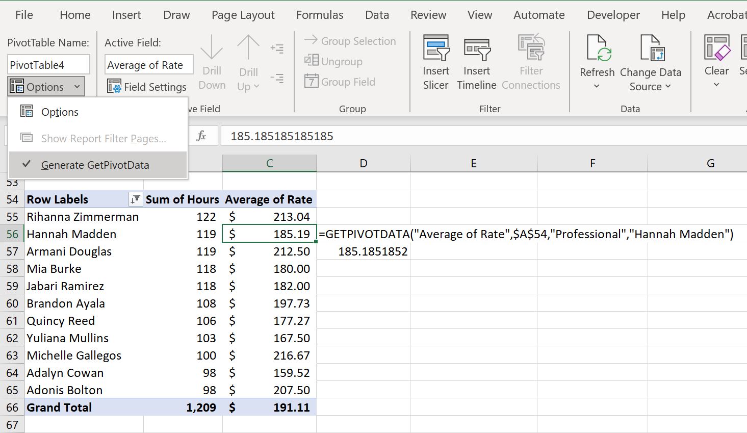
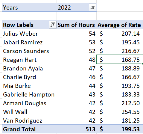
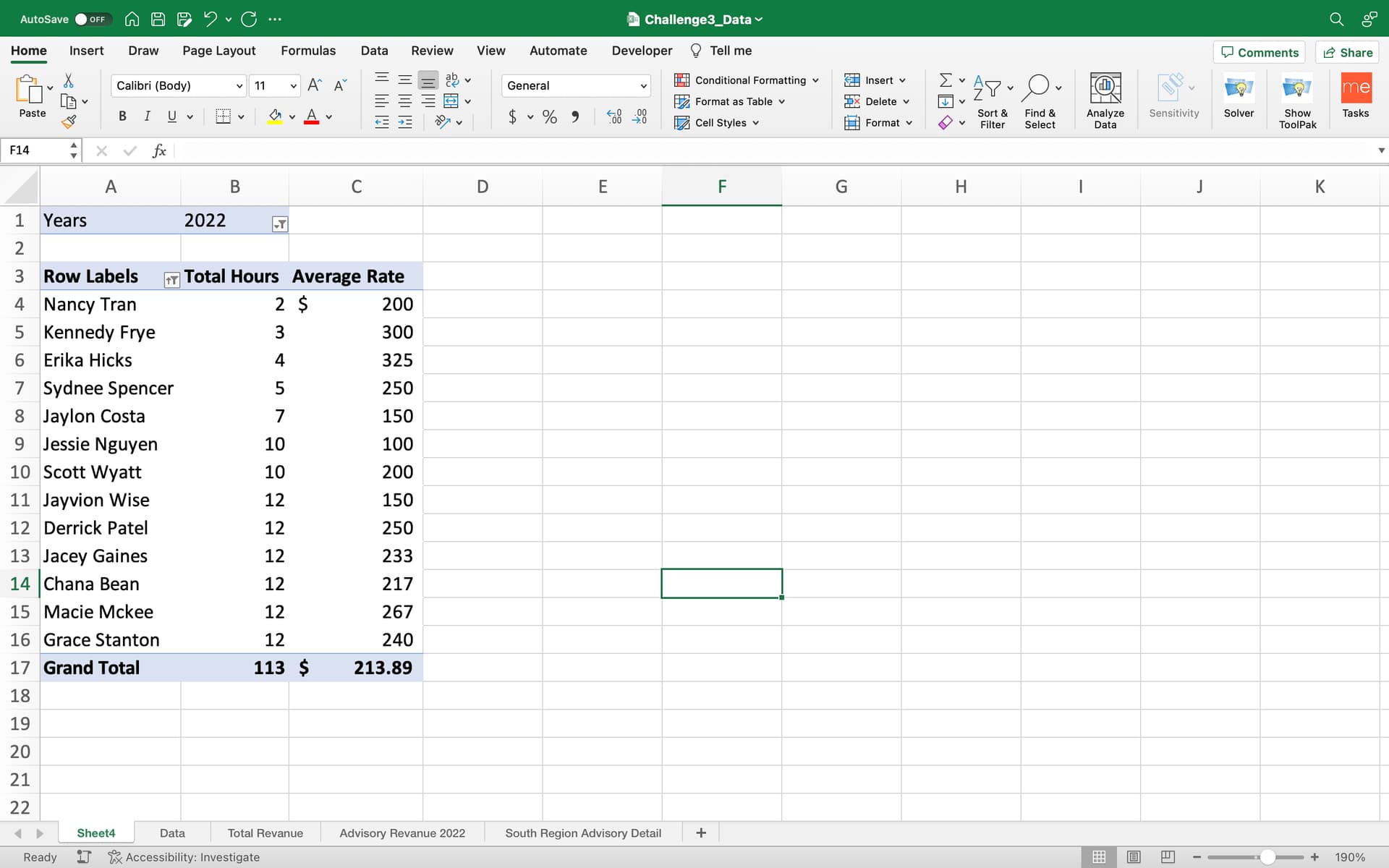
Fourth, create a pivot table displaying the top 10 professionals who billed the most hours in 2022, the total hours they worked and the average rate they billed. Sort by total hours works from largest to smallest. Format the table, so average rate is rounded to the nearest cent. The pivot table should be in a new sheet called “Top 10 professionals”.
Data Files
Suggestions and Hints
To filter the top 10 professionals by their hours, click the dropdown labeled “Row Labels” at the top of your pivot table, select “Value filters”, then select “Top 10”.
Solution